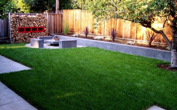
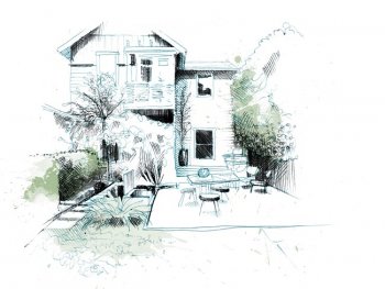
 Just yesterday, as I was starting the design of a patio that I wanted to separate from an adjacent play area, it gave me instant guidance for how tall a hedge I would need: the area was 17 feet wide, and so my hedge should be at least 6 feet. Sit near a tree in the park, or a wall, and gradually edge away, and you’ll see how it works. Of course, there are times when the point of a landscape design is a monumental sense of scale or view, but the best gardens, whatever their size, modulate a feeling of enclosure and openness, and this rule will help.
02: FOLLOW THE REGULATING LINE
My formal architectural education also introduced me to the concept of the “regulating line.” The idea is that an element of architecture (for example, a doorway, or a building edge, even a window mullion) or a distinctive landscape feature (prominent tree, existing pool, property boundary) can “generate” an imaginary line that helps connect and organize the design. For example, in laying out one backyard, I projected the lines of its building addition into the garden space and then aligned the swimming pool and wooden walkway with those lines. The result is orderly and cohesive, even after being softened with planting. “A regulating line, ” wrote the great architect (and theoretician) Le Corbusier, “is an assurance against capriciousness…It confers on the work the quality of rhythm…The choice of a regulating line fixes the fundamental geometry of the work.”
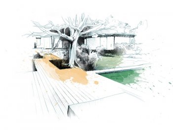 The decking on a different project in Pacific Palisades, CA, creates a regulating line that is parallel to the plane create by the gray wall of the house in the upper right of the image. Another regulating line is created by the edge of the pool running parallel to the glass window on the home. These lines intersect at the base of the tree. Illustration by David Despau.
Le Corbusier hits on the two aspects (a bit paradoxical, perhaps) that make the regulating line so valuable. First is the idea of underlying order: that the garden, for all its naturalness, or wildness, is founded on strong principles—what’s sometimes known in garden circles as “good bones.” Second, that regulating lines—at least as I employ them—are subjective; it’s the designer who identifies and manipulates them to create the garden. And I’d say that the use of the regulating line, more than any other concept, separates professional from amateur design.
03: USE THE GOLDEN RECTANGLE TO GET PROPORTIONS RIGHT
Certain rules help us refine design. One is the Golden Ratio which is a ratio of proportion that’s been observed in everything from the Great Pyramids at Giza to the Greek Parthenon and has been used throughout history as a guide to a pleasing sense of balance and order.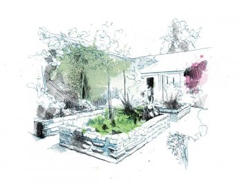 The practical application that I make of the Golden Ratio involves its sibling, the Golden Rectangle, in which the ratio of the short side to the long side is equal to the ratio of the long side to the sum of both sides (a/b = b/a+b)—you probably didn’t know that landscape architects had to learn math. Numerically, the Golden Rectangle ratio is close to 1: 1.6, a proportion I regularly use to lay out terraces, patios, arbors, and lawns. The raised beds in my vegetable garden are 5 by 8 feet. It’s a rectangular proportion that always looks good—they don’t call it golden for nothing!
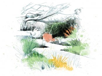
Raised planters in my garden follow the Golden Rectangle. Note, too, the significant enclosure provided by the Eugenia hedge. Illustration by David Despau.
 04: TURN TO THOMAS D. CHURCH WHEN DESIGNING STEPS
Another ratio may even be platinum: That’s what I’ve always called the rule for step design advocated by landscape architect Thomas D. Church, often credited with creating the California style. Laid out in his seminal work, it says simply that twice the height of the riser plus the tread should equal 26 inches. That means that if the riser is 5 inches, the tread (what you walk on) should be 16 inches. All I can say is that the rule is true, and I’ve used it from steep canyon faces to gentle changes of patio levels. A useful corollary states that 5 feet is the minimum width for two people climbing steps side by side.
At this Mediterranean inspired garden in the Westwood neighborhood of Los Angeles, the tile-faced steps follow Church’s ratio. Illustration by David Despau.
05: SIZE MATTERS
A final rule related to scale and the sculpting of space is this: Go big. Faced with a decision to make a staircase wider or narrower, a pool longer or shorter, a pergola higher or lower, the answer is almost always the former. In my own garden, I remember laying out an arbor, with its posts 10 feet high, and listening to trusted friends wondering whether it wasn’t “a little too tall.” Thankfully I stuck to my guns, and some 18 years later, wreathed in wisteria and anchored at the ground by clusters of pots, the arbor seems just right.
At ten feet, this arbor in my garden allows for hanging and surrounding foliage to intertwine and connect the arbor to the space without infringing on the sense of space. Illustration by David Despau.


