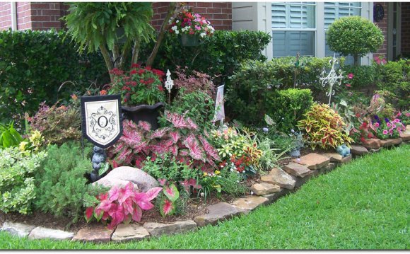
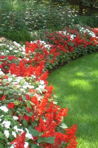
 My favorite way to lay out a curve in a garden is to use a 100 foot tape measure as a compass of sorts. I lay out a uniformly shaped curve from a central radius point. Then, using ‘marking’ paint (not spray paint!) or a line of powdered limestone, I mark the ground as I pivot around. The resulting gentle curve creates an even “disposition” to a landscape scene.
2. The Mystery of the Unseen
If you want to make a small outdoor space more interesting or appear larger, you can use an ancient Japanese design technique known as miegakure or ‘hide and reveal.’ This entails partially obscuring a view or features in a garden to create an illusion of distance. A half-hidden vista also encourages people to explore a space because the ‘mystery of the unseen’ is quite tantalizing. If you see only a partial view of a landscape you will invariably move forward to see what is ahead.
These stone and gravel steps curve down and out of sight beckoning you to go further. The light-color of the steps make them stand out in this shady spot and their width allows plants to grow over the edges without limiting room to walk. Photo by: Jan Johnsen.
You can hide parts of your garden by planting a leafy plant in a strategic spot, angling a walk or set of steps or locating a mounded plant bed in front of the view. You can even use shadows to darken an area which makes it appear to recede in the distance.
3. Pooling and Channeling
People move through space in the same way that water flows—it moves rapidly through a narrow channel and slows when it flows into a larger, wider pool. Similarly, people move faster in a narrow walk and slow down or pause when they arrive at an opening. Knowing this, you can use a design technique called, 'pooling and channeling, ' to lead and direct people through a space.
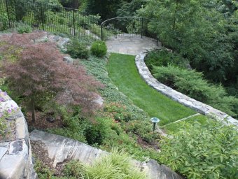
The grassed walk, or ‘channel, ’ leads to a fenced-in round overlook. The stone paving and the round shape of the ‘pool’ invites people to pause and look down into the wooded slope below. Photo by: Jan Johnsen.
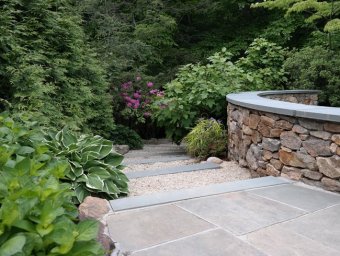 So, when you lay out a walk, think about the areas where you might want people to stop and enjoy the view. Widen the walk or create a larger stopping area here to encourage them to pause. You can even place some chairs here, telling them to stay a while.
You can also widen the intersection where two walkways meet. Conversely, if you want people to move rapidly through a space, keep the walks fairly narrow.
4. Capture the View Beyond
In Japan, they use a design technique called ‘borrowed scenery’ to make a small outdoor space more interesting. They incorporate a view of a feature, large or small, that lies beyond the garden to carry the eye out. You can ‘borrow’ a view of a distant building, mountain or just a neighbor’s nearby pine tree or crabapple.
In order to borrow scenery, you may have to keep a fence lower or a hedge trimmed to a certain height so you can see over them. Or you might have to trim back the branches of a wide spreading tree in order to reveal something beyond it. The Japanese have four categories of ‘borrowed scenery’ that relates to their location:
- Far - view of a distant mountain or similar
- Near - a feature just beyond a fence
- High - looking up above the trees
- Low - something low or through an opening
5. The Principle of Three Depths
We all know the words ‘foreground’ and ‘background’ but have you heard of ‘middle ground?’ It separates the front from rear and is essential for a compelling view. This is called ‘The Principle of Three Depths' and is used in Asian landscape painting. George Rowley, describes it in his book, Principles of Chinese Painting:
 "The Chinese perfected the principle of three depths according to which spatial depth was marked by a foreground, a middle distance, and far distance, each parallel to the picture plane, so that the eyes leapt from one distance to the next through a void of space…"
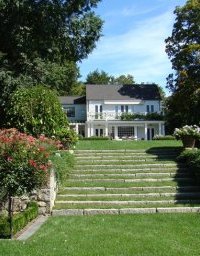
The principle of three depths is well illustrated here—in this scene, the red roses are in the foreground, the grass steps make up the middle ground and the house in the background is the third ‘depth.’ Photo by: Jan Johnsen.
A long view, therefore, is more interesting with some-thing placed in a central zone where the eye can rest. It also increases the perceived depth by providing a central reference point.
6. Tricking the Eye
In a long perspective view, the lines of a walk seem to converge, the farther away they travel, the closer they become. This visual cue creates a sense of depth in any outdoor space. You can use this trick in a small outdoor space by slightly angling the lines of a walk inward, making it appear longer than it actually is. You can do this also with a plant bed or pergola. The key is to angle it in very slightly to appear as a natural perspective.
This stony drystream appears lengthier because it narrows on one end and is covered in foliage. Photo by: Jan Johnsen.
You can apply this trick to plant beds that border a lawn. If the bed lines angle inward, the lawn between them appears a little deeper than it really is.
7. The Long View
Long, straight views inexorably lead the eye and you cannot help but follow its line to the end. Therefore, grab the lengthiest straight line you can in an outdoor space and use it to its best advantage. A long view may involve looking diagonally across your yard or down a slope. Russell Page, the celebrated English landscape designer, wrote about creating long views in his book, The Education of a Gardener (published 1962):
"Where a site suggests to me a long straight axis, I try to keep this axis as narrow as I can, proportionately to the area I have to deal with….Such straight lines focus the attention and give direction to a garden design — you may interpret them in a hundred ways."
I created this long view as a promenade. Walking here, you can enjoy the flower border of deer resistant white Angelonia ‘Serena’ and blue Ageratum but your eye goes straight to the gate and steps at the end. Photo by: Jan Johnsen.
8. Irresistible Lookouts
A lookout is one of the most exciting areas in a landscape. Elevated locations such as the top of a slope, a rock or a bridge, can serve as a ‘prospect’ where we can stop and enjoy a view. It seems to be a universal urge to climb a hill and look out from a high point upon the scene below.
Lookouts and overlooks all share one thing in common—a high perch. The example shown here looks down on a watery view of a pond. Photo by: Jan Johnsen.
You may have to clear an opening in order to reveal a vista. Or you may have to level out a small area at a high point on a slope to create a place for a bench. But the work is worth it because a lovely view offers up a commanding presence and connects us to our surroundings. This is what makes a lookout so appealing—because for a brief time we are lord of all we survey.

